Musical Posters
Design Brief
To create a cohesive poster collection for the 'Hatchetfield' Musical series by Team Starkid, a small American Theatre Company who upload all of their musicals free to YouTube. The posters should have designs that represent each musical individually as well as as a collection.
To create a cohesive poster collection for the 'Hatchetfield' Musical series by Team Starkid, a small American Theatre Company who upload all of their musicals free to YouTube. The posters should have designs that represent each musical individually as well as as a collection.
Poster 1 - ‘The Guy Who Didn’t Like Musicals’
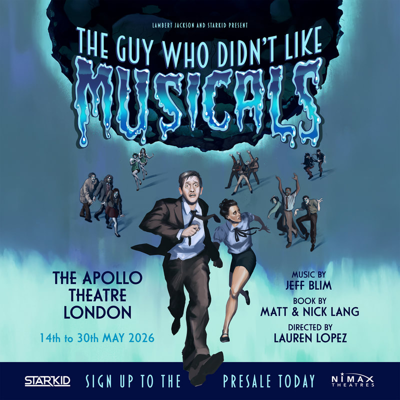
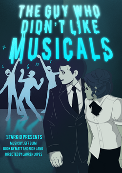
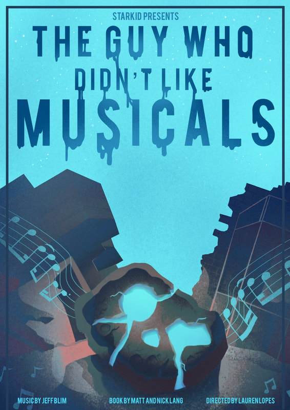
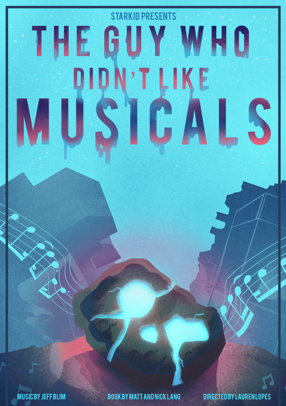
Horror-comedy musical that follows Paul, a guy who doesn’t like musicals, as his home town is slowly overtaken by an alien hivemind that turns everyone into singing and dancing zombies. The first of three musicals in the Hatchetfield series. The show originally ran in 2018, with an updated revival show in 2025.

|
|

|

|
Thumbnails
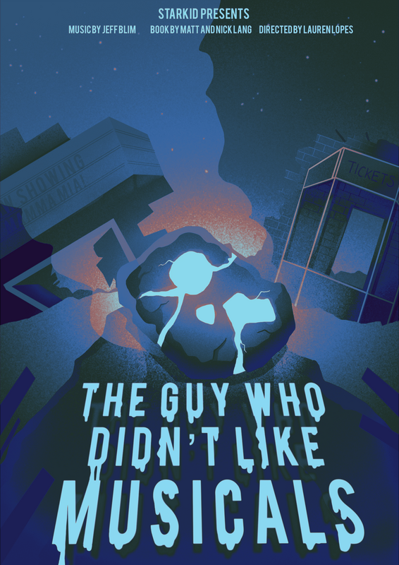
The main colour associated with TGWDLM, and therefore the colour I wanted to include most in the poster is blue. This is the same colour as the musical’s “alien goo,” and the colour of the meteor in the revival. Other features to potentially include in the poster are the singing hivemind (draw characters infected in the show), the two protagonists Paul and Emma, or the theatre the meteor crashes into near the beginning of the musical.

|
Meteor from the revival trailer with its new updated design, meant to depict the face of the musicals' unseen alien antagonist and it's signature blue colour.
|

|
Illustration Progress

|
|
|
|

|

|
|
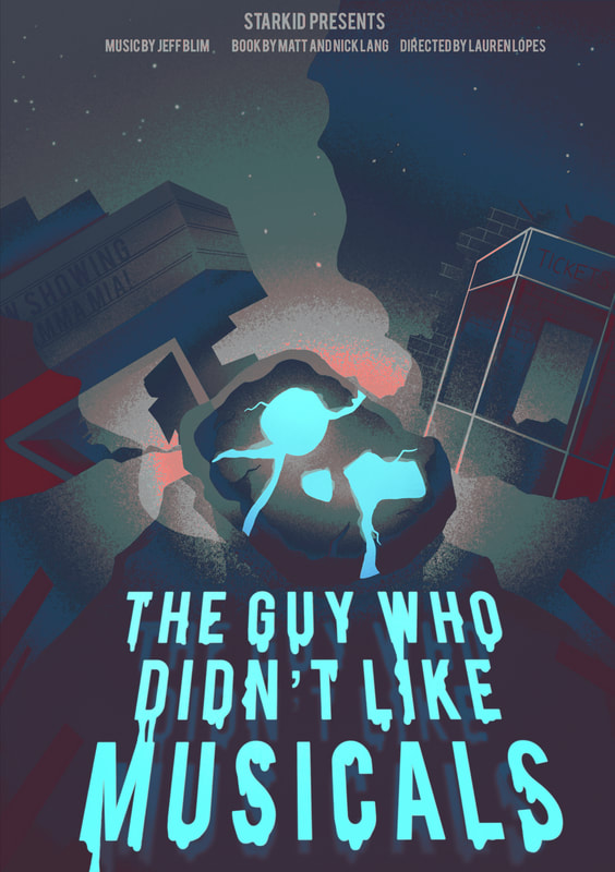
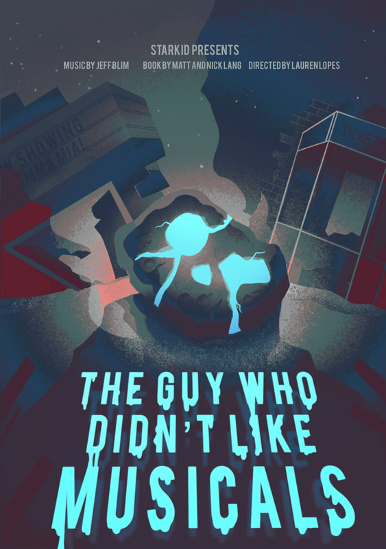
Working towards the final version of the poster. The musical score I included is taken directly from the score of the musicals title song 'The Guy Who Didn't Like Musicals.'

Poster 2 - ‘Black Friday’
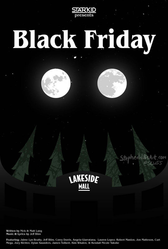
Horror-comedy musical that follows the residents of Hatchetfield as they’re brainwashed to become murderous shoppers all fighting for the new toy craze the ‘tickle me wiggly.’ This is the second of three musicals in the Hatchetfield series, the show originally ran in 2020.

|
|

|

|
Thumbnails
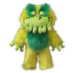
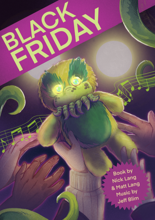
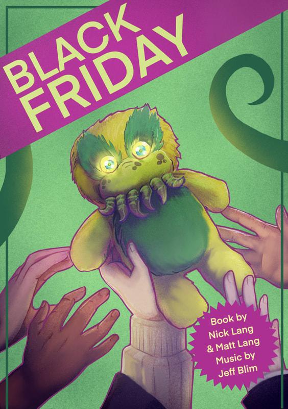
Notable features to include, the 'Wiggly' doll that centres the musicals main plot, and the colour green heavily associated with it. Purple and blue are secondary colours also used within the musicals initial promotional materials. - include the toy store / toy packaging - and/or the green tentacles of the musicals eldritch antagonist. In the pro-shot for the show 'Wiggly' appears as two glowing eyes (circular lights held up on stage by ensemble members), these could also be incorporated into the final look of the poster.
Notable features to include, the 'Wiggly' doll that centres the musicals main plot, and the colour green heavily associated with it. Purple and blue are secondary colours also used within the musicals initial promotional materials. - include the toy store / toy packaging - and/or the green tentacles of the musicals eldritch antagonist. In the pro-shot for the show 'Wiggly' appears as two glowing eyes (circular lights held up on stage by ensemble members), these could also be incorporated into the final look of the poster.

Working towards a final concept. Again the score featured in the poster is taken from the song 'Black Friday' that features in the musical.

|
|
Poster 3 - ‘Nerdy Prudes Must Die’
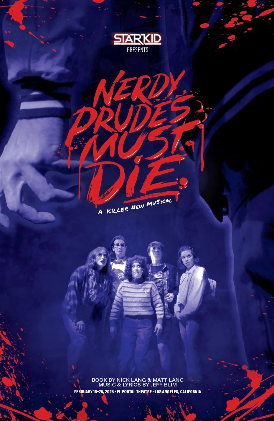
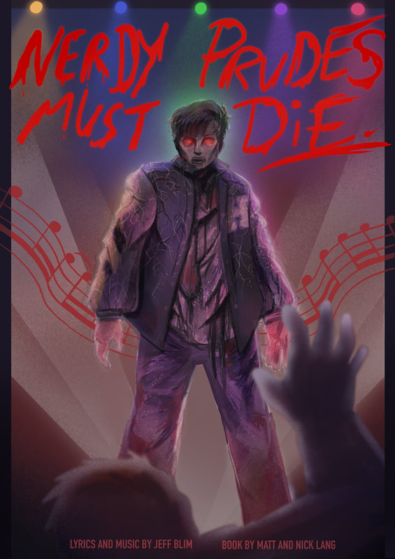
A teen-slasher comedy musical following the losers of Hatchetfield High, after they unwittingly complete an ancient ritual, becoming haunted by a ghostly tormenter, an angry all powerful spirit with a grudge against nerds. The third and final musical in the Hatchetfield series, the show originally ran in 2023.

|
|

|
Thumbnails
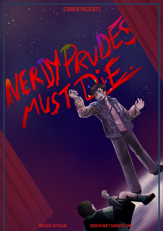
The existing branding of the musical uses a contrast of blues and reds in their design. Visuals to potentially feature: the musicals antagonist and main cast, and/or the haunted manor where the inciting incident of the story takes place. There is a scene in the musicals title song where the antagonist towers over one of the main characters before they're killed, I could reference this in the poster.
The existing branding of the musical uses a contrast of blues and reds in their design. Visuals to potentially feature: the musicals antagonist and main cast, and/or the haunted manor where the inciting incident of the story takes place. There is a scene in the musicals title song where the antagonist towers over one of the main characters before they're killed, I could reference this in the poster.
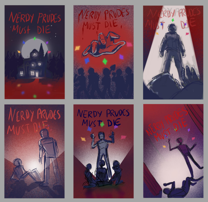
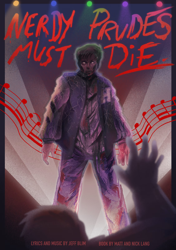
Working towards the final concept. The score featured is from a song within the musical.
|

|
Complete Poster Set
|
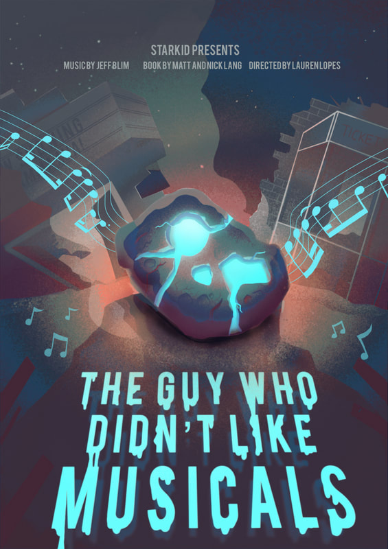
After feedback: lightened the buildings in the background to move them out of focus, added warmth behind the meteor to bring it into focus.
|
|
After feedback: Lightened the colour of the music score as it appeared too similar to the title. Added red to the character’s eyes to tie in the imagery and typography together better.
|
Alternate Versions
After feedback: lightened the buildings to create better contrast between the foreground and background.
|
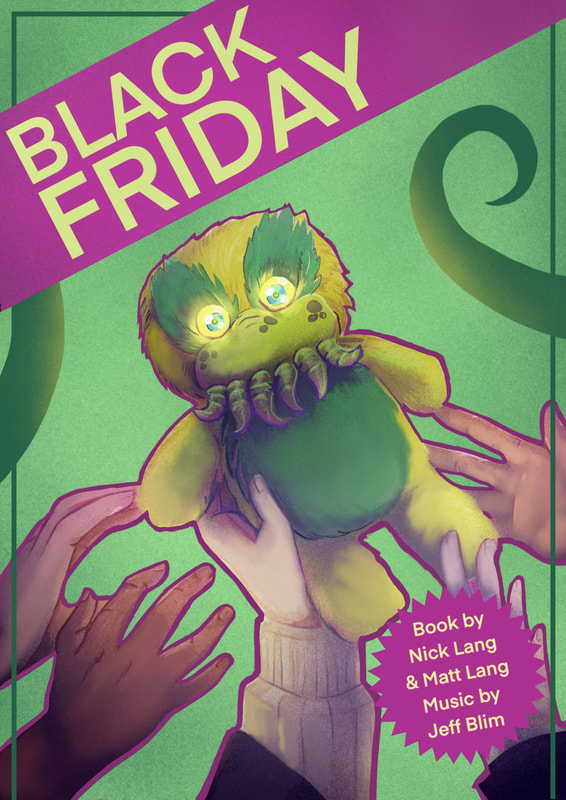
After feedback: made key line smaller and appear around all objects rather than only around the foreground image.
|
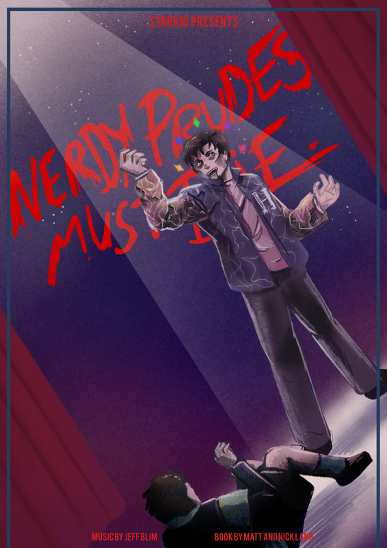
After feedback: Added lighting to remove access negative space and drawn attention to the character.
|